You've seen those cycling or running videos on YouTube where the data overlays look perfect. Speed, heart rate, power — everything sits exactly right, appears at exactly the right moment, and never distracts from the footage. Meanwhile your own exports feel cluttered or amateurish, even though you're using the same tools.
The difference isn't the equipment. It's five specific techniques that experienced creators use — and almost never explain in their behind-the-scenes videos. Here's the full breakdown.
Trick #1: The Pre-Action Sync Offset
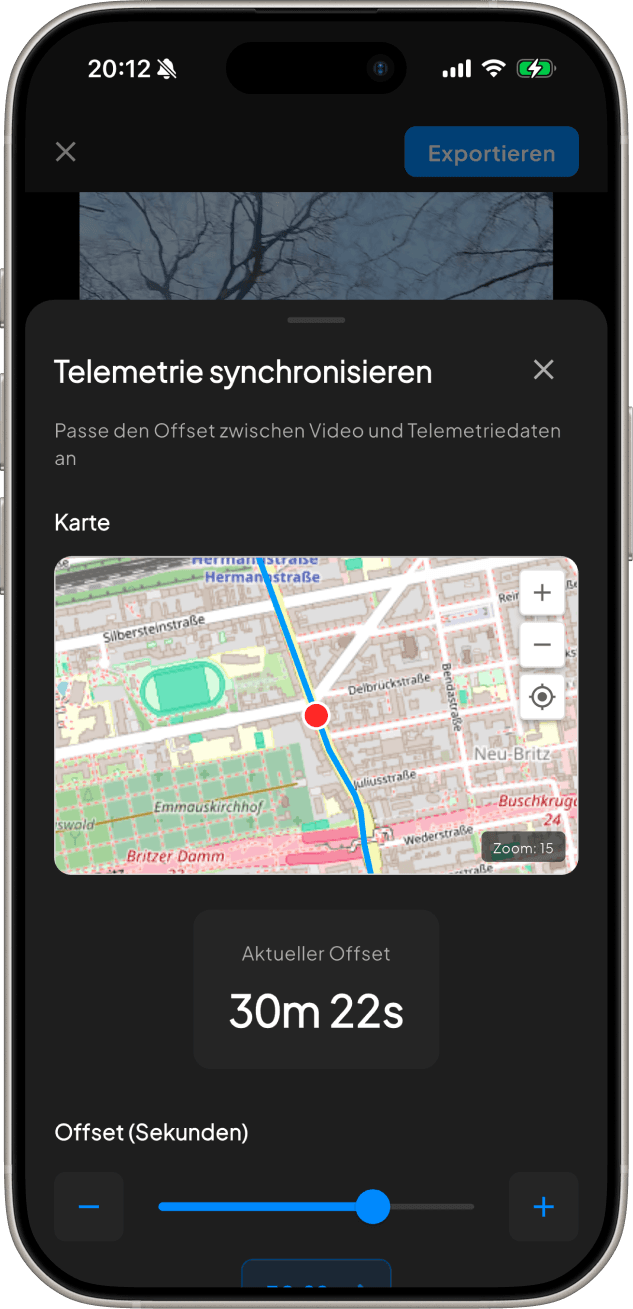
Here's the single biggest upgrade you can make to your overlays: shift your telemetry data so it changes before the action happens on screen, not as it happens.
When a viewer sees your heart rate spike, their brain expects to see effort on screen immediately. If there's even a slight delay, it kills the immersion. Pro creators intentionally apply a negative sync offset of around 1.5–2.5 seconds so the data starts rising just as the climb or sprint becomes visible in the frame — not a moment after.
In BeInMotion, use the sync slider in the telemetry alignment step. Drag left (negative offset) until the data peaks land 1–2 seconds before the peak effort appears in the footage. Play it back a few times and trust what feels natural — your gut is a surprisingly good calibration tool.
Trick #2: The Minimal Stack — Show Less, Feel More
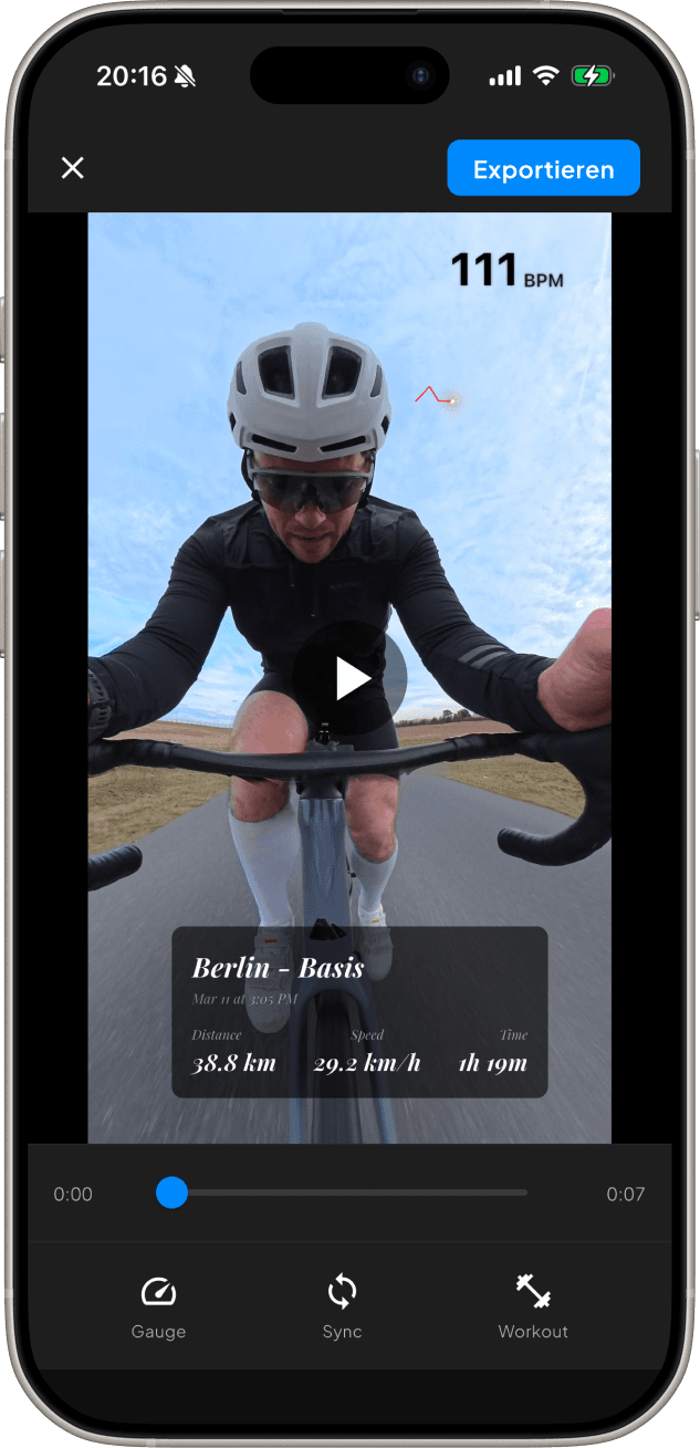
Most beginners add every available metric to their video. Speed, heart rate, power, cadence, elevation, calories — the full dashboard. It looks impressive in theory, but in practice it turns your video into a data spreadsheet that nobody wants to watch.
Pro creators pick a maximum of 2–3 metrics per video, chosen based on the story they're telling. A climbing video? Show power and elevation. A sprint segment? Speed and heart rate only. A long endurance ride? Heart rate and animated route map.
- Climbing content → Power + Elevation profile
- Sprint or race recap → Speed + Heart rate
- Endurance or adventure ride → Heart rate + Animated route map
- Swim or run → Pace + Heart rate (no GPS map overlay needed)
Less is more. Two clean widgets in the right spots will outperform six crowded ones every single time. Your viewers are watching your ride, not reading a lab report.
Trick #3: Corner Placement With Breathing Room
Where you place your widgets matters as much as which widgets you choose. The most common mistake is placing them too close to the edges — or worse, directly over the most visually interesting part of the frame.
Professional editors follow a simple rule: give every overlay element at least 3–5% breathing room from the screen edges. This small margin prevents the overlay from feeling pinned to the frame and gives the entire composition space to breathe.
In portrait mode (for TikTok and Reels), place your most important metric in the lower-left corner. Viewers' thumbs hover on the right side of the screen — keeping key data on the left prevents accidental blocking and keeps engagement visible.
Trick #4: The Route Reveal
An animated GPS route map is the most visually compelling overlay you can add to a cycling or running video. But most people use it in only one way: a dot moves along the route from start to finish as the video plays.
The route reveal technique works differently. You start with the full route already visible in the corner, and use the animation to draw attention to the current position — a moving dot or a progress highlight — rather than progressively drawing the route line.
Why does this work better? It immediately shows the viewer the full scope of the adventure. A viewer seeing a complete route map understands instantly: this is a serious ride. The psychological effect is that every segment of your video feels more epic because the viewer already knows the full context — and they're watching to see how you handled each section.
Trick #5: Export for the Platform, Not the Archive
Here's a workflow trick that almost nobody talks about: export your video twice, in two different formats, optimized for different platforms. Most creators export once and post the same file everywhere. The pros treat each platform as its own creative format.
YouTube favors 16:9 landscape. Widgets in the lower-left or upper-right corners. Speed and power pair well here since viewers have more screen space to comfortably read data without it feeling crowded.
TikTok and Instagram Reels demand 9:16 portrait. One or two widgets max, positioned in the lower third of the frame. The route map (if you use one) sits in the top-right corner where it stays clear of caption text and the like button.
- YouTube: 3840×2160 (4K) or 1920×1080, landscape, 2–3 widgets
- TikTok / Instagram Reels: 1080×1920, portrait, 1–2 widgets max
- Instagram feed (square): 1080×1080, center-weighted layout
The extra five minutes it takes to export a second format can double or triple the total reach of a single ride. A cycling video that performs modestly on YouTube can go viral on TikTok if it's in the right format with the right overlay layout — the algorithms treat them as completely separate content.
Putting It All Together
None of these tricks require expensive software, hours of editing, or a professional production background. They're about intentionality: choosing the right data, placing it thoughtfully, syncing it precisely, and formatting it for where it'll actually be watched.
The best sports content creators don't think of their telemetry overlays as data readouts. They treat them as narrative tools. Your heart rate rising at the same moment the camera tilts up toward the summit isn't just interesting — it's storytelling. And that's what keeps viewers coming back.
BeInMotion
Ready to fill your map?
Download BeInMotion and make your next workout the first entry in your personal world. Start Pro free for 7 days.
Download on the App Store7 days Pro free · iOS app